Have you ever encountered an establishment or a brand without a logo? That is like a person without a name, right? A company’s logo is the recognition scheme for the public – it is one way of permanently planting the brand or the certain innovation to the people’s minds. In simper terms; a company’s small part is its brand logo. Imagine if logos did not exist – would you be able to visualize a certain brand?
What is a company without its emblem? What is a brand without a picture that would be printed into the minds and hearts of the public? We have gathered 12 of the most famous brands in the world along with how they looked like before and how the logos have evolved over time.
Microsoft
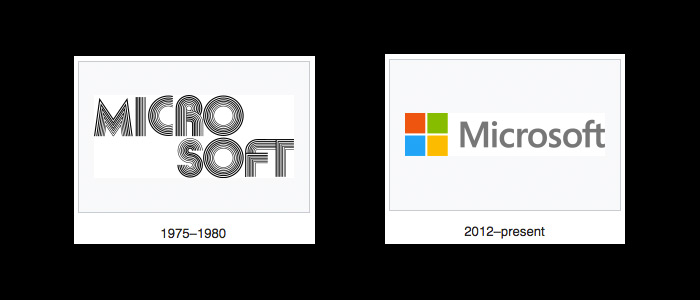
If you have been living under a rock, then you most probably haven’t heard of Microsoft. Microsoft is known as one of the most famous companies or brands in the world. The person who was victorious – Bill Gates, owner and former chairman of Microsoft, is known as the world’s richest man.
You would notice that before, Microsoft’s logo is separated by one space above. I guess their logo now is more detailed but more simpler.
Nike
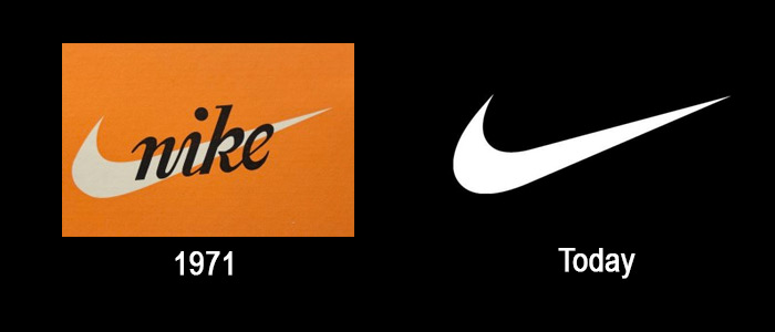
Well we have all heard of it and we have all encountered its trademark. A swoosh or a single curved line that goes thicker at one end and officially known as the “Nike Swoosh.”
Be it shoes, shirts, jackets – you name it. Its logo is spread out elsewhere in the world and one glimpse of it would instantly let you become aware of what it is. Would you be able to notice it with its past design?
Pepsi
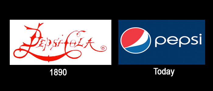
The original logo of Pepsi is designed to make you feel thirsty. As research suggested, this is why most fast food chains dominantly inculcate the color “red” in their design – especially in their stores. This was the past plan of Pepsi but then, as logos evolved, they came up with more stylish and sophisticated design.
Xerox
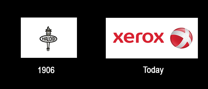
Many people has this misconception that the word “Xerox,” is the term for “photocopy.” To clear things out, Xerox is a brand and photocopy is the action.
The history of the Xerox logo began in 1906 when Xerox was still known as the Haloid Company. The Xerox logo you see now was just generated and redesigned in 2008.
Apple
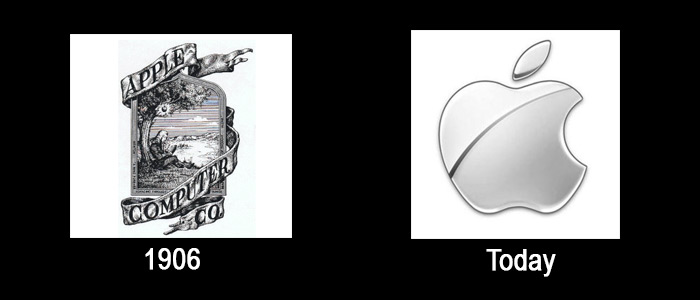
And now behold one of the most known companies all around the world. Many of us do not really know how the Apple looked like before – well it’s not really expected since what we see now is the logo that most sophisticated people (the upper class) usually wears.
The logo that we know now was just only redesigned in the year 2000.
Shell
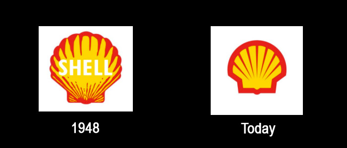
Shell’s logo back in 1940s was simple and realistic. It was like a real scallop shell and today the logo is bold, and much more simple.
According to the company the new logo is more memorable and recognizable, that is the reason why they simplify it from being distorted in small images.
IBM
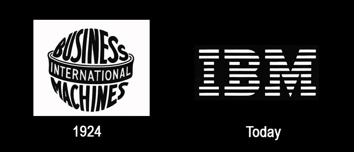
The company adapted the name International Business Machine Corporation in a form of a globe.
They decided to drop the globe from its logo to represent the changes in the company from a punch card tabulating machine business t o computers and to show through the logo that it is more solid, and balanced.
They also made the stripes design instead of having the solid front to illustrate “speed and dynamism”
Mercedes-Benz

Mercedes-Benz came from the name of two car companies – DMG and Benz and Cie.
The logo started with just a simple name – Mercedes. But when the company merge into one, they change it into a three-pointed star of Mercedes and the laurel wreath of Benz.
The logo has always been acquainted with “luxury cars.”
Nokia
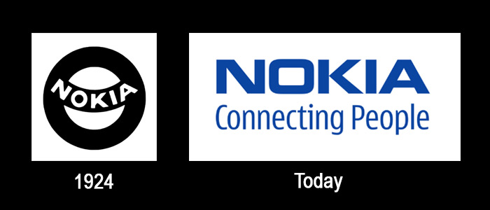
Nokia’s logo has something to do with its line of business.
This is corporation was formed when two company, Finnish Rubber Works and Nokia Wood Mill, merge. They sold products like TV, shoes, car and also tires.
At this point of time, they are into sales of electronic gadgets particularly cellular phones.
Starbucks
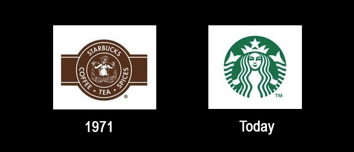
Maybe most people are wondering who the siren is in the Starbucks logo.
Aside from being the most popular coffee chain in the world, their Starbucks logo is also considered the most instantly recognizable logo. This comprises a circular ring surrounding the mythical two-tail mermaid figure n a coffee brown color palette. It was later simplified into a green color, bare breast covered by mermaid’s flowing hair.
Coca-Cola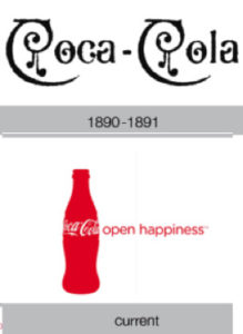
Partners, John Pemberton and Frank Robinson, believed that the two Cs would look well in advertising. They use the Spencerian script in 1887 and later change to Extra Twirls in 1890.
It was in 1958 when the logo was change to a fishy shape. When Coca-Cola celebrates their 125 years in 2011, the logo was change into a contour bottle with bubbles bursting.
The current logo is the contour bottle with a phrase “open happiness.”
Mc Donald’s
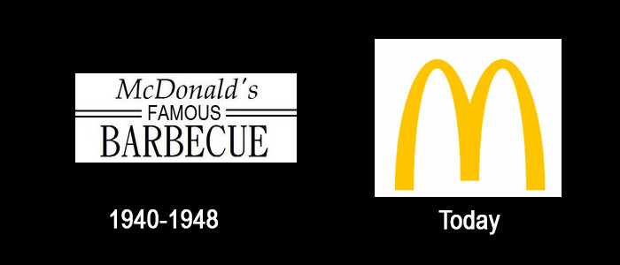
Mc Donald’s when founded in 1940 was originally a famous barbeque restaurant. Then later renamed McDonald’s Famous Hamburgers in 1948.
The name was later shortened to McDonald’s in 1953. It was in 1961, when Golden Arches introduced a new company’s symbol. The “M” formed by the arches defined the company’s logo.
