It’s already an era that almost everyone is using a smartphone. Each and every day we use our phones to communicate with each other, spend free time playing games or even watching a video to make time pass by faster. Surely you know or might have heard of the app Facebook Messenger, right?

Way back then, when Facebook just started, Messenger doesn’t exist. Facebook was just usually accessed via a computer and messaging via the site was referred to as Facebook Chat. But as time flew by and smartphones became almost a necessity, Messenger sprung to life and this was similar to the old Facebook Chat but was more focused on connecting people via mobile devices.
Read: Facebook may Release an Unsend Message Option in Messenger
Messenger has undergone many changes throughout time. From being just a plain messaging app, to having the capability of playing games within the app, it really has changed quite a lot.
Before the current update, we were used to seeing messenger having a blue header with many tabs, but now that the update has rolled out to everyone, there were some big changes to how messenger looks like.
Read: How Can You Tell If The Public Wi-Fi Is Safe From Hackers And Criminals?
What was the redesign and what are the changes?
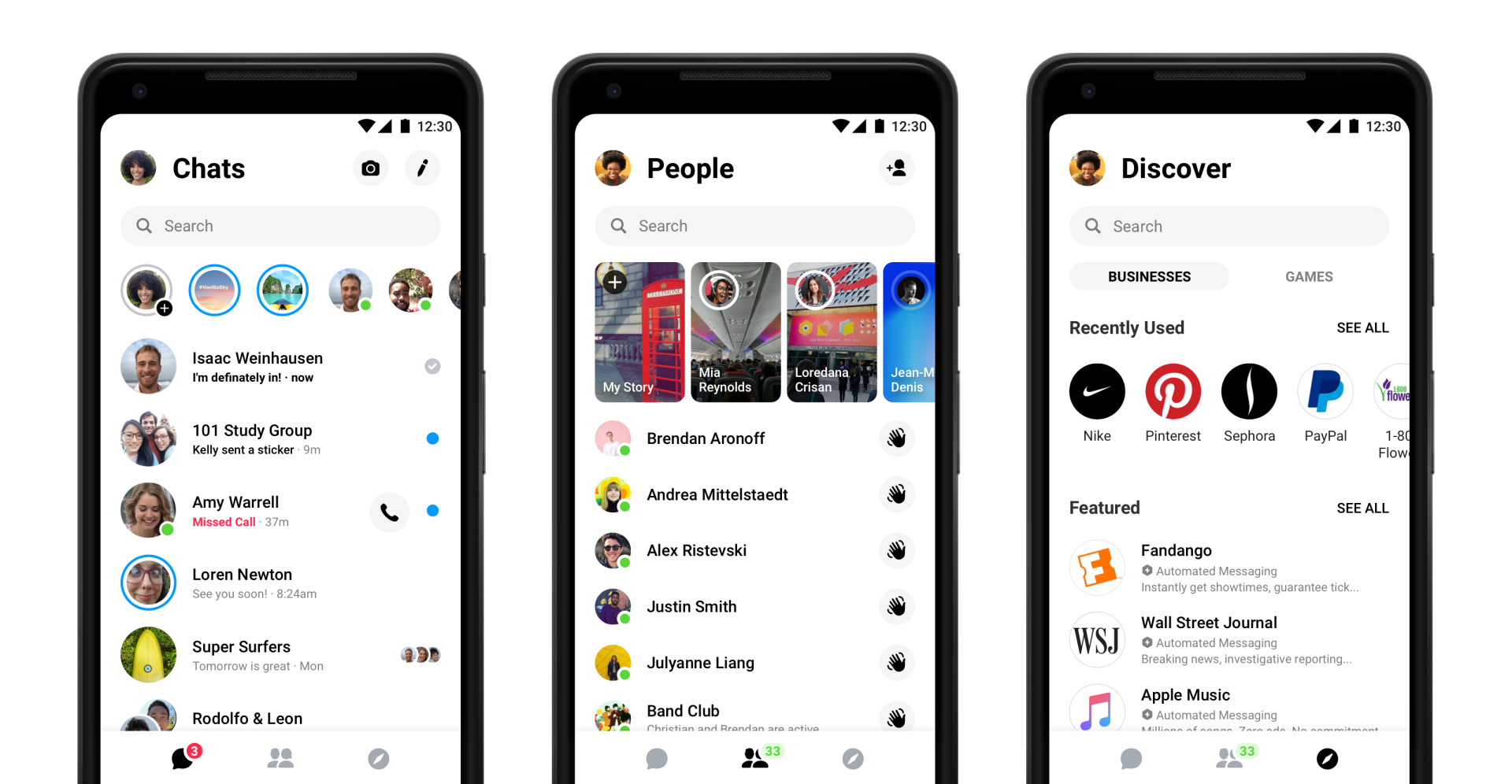
With the new design, the tabs were consolidated into three (3) tabs only: Chats, People and Discover. The Chats of course is the category where the messages are going to be seen. The People tab is the category where you get to see who is online. Lastly, the Discover tab which allows you to explore more via the Messenger app. The discover has two (2) categories: Business and Games.
The color of the interface also changed to just being Black and White for the fonts and background being used by the application itself. From what we can see, Messenger is aiming to look cleaner and easier to navigate.
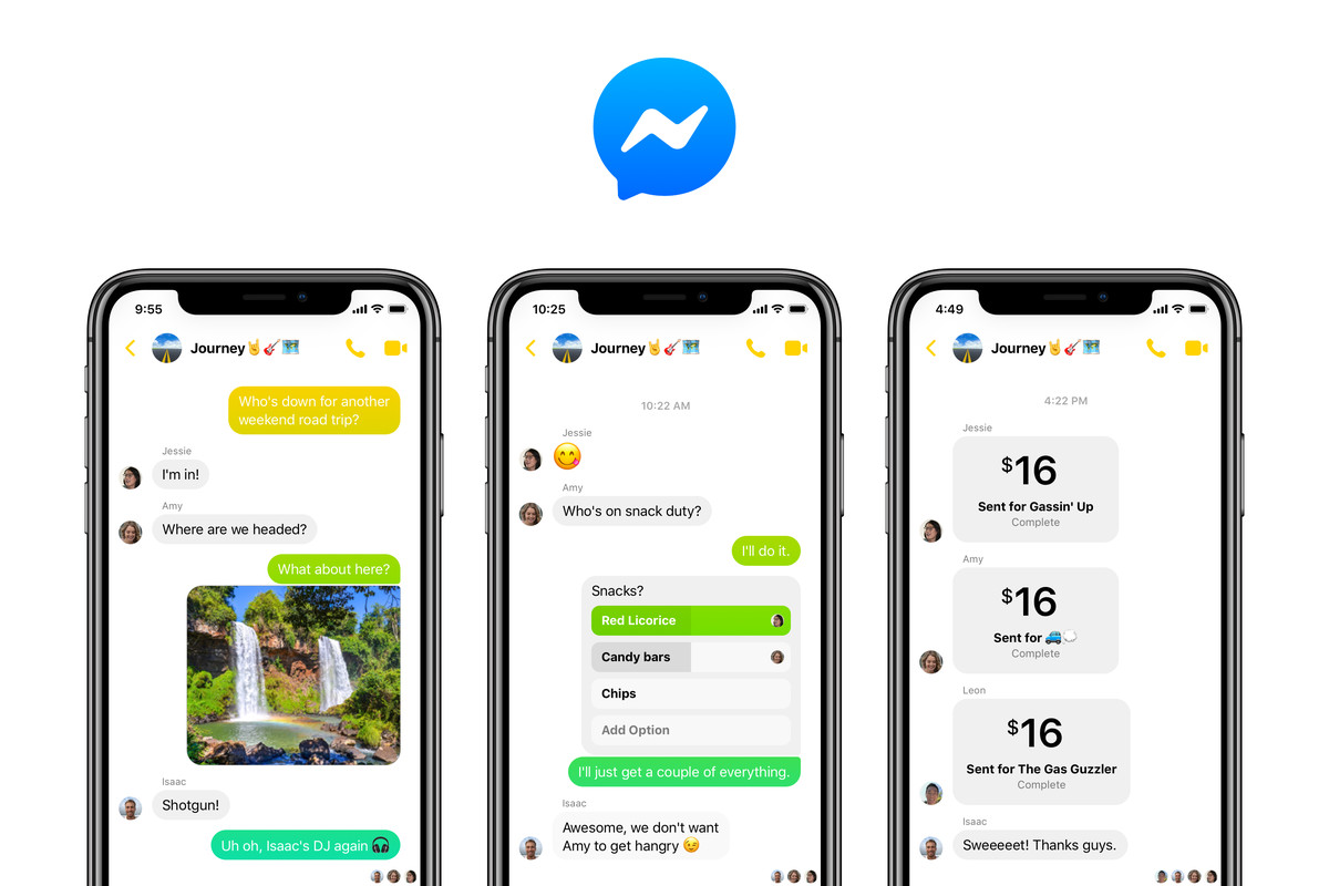
Under Chats, it still serves the same function, showing all your messages and SMS (if you enabled it via settings). Once you open a message, pretty much it’s still the same, just with a cleaner user interface, but one thing that they added was color options for the chat bubble.
The People tab is almost the same except that it is now also displaying the My Day that your friends posted for the day. In the list, you can now Wave to your friends who are active.
The Discover tab is pretty much the same as well, allowing you to have a look at different options that you might have interests in. It could be for games or for businesses (Facebook pages).
Read: How Can I Send Webpages From Chrome PC to Phone?
New colors of the chat bubbles
The usual colors were standard, but they have added the options to have the chat bubbles be in rainbow color. If you scroll over the messages you have sent, you’ll see that the color changes as the text moves up or down. “People” still show the friends that you’re connected with via Facebook and who’s currently online, then under “Discover” still shows games you can play and business or services you might be interested.
Messages

For the messages, one new update is by swiping to the left reveals different other options. With Messenger’s new redesign, swiping to the left will allow you to do the following:
- Open the Settings to modify the message thread;
- Mute a person or a group; and
- Delete the specific conversation
Messenger profile

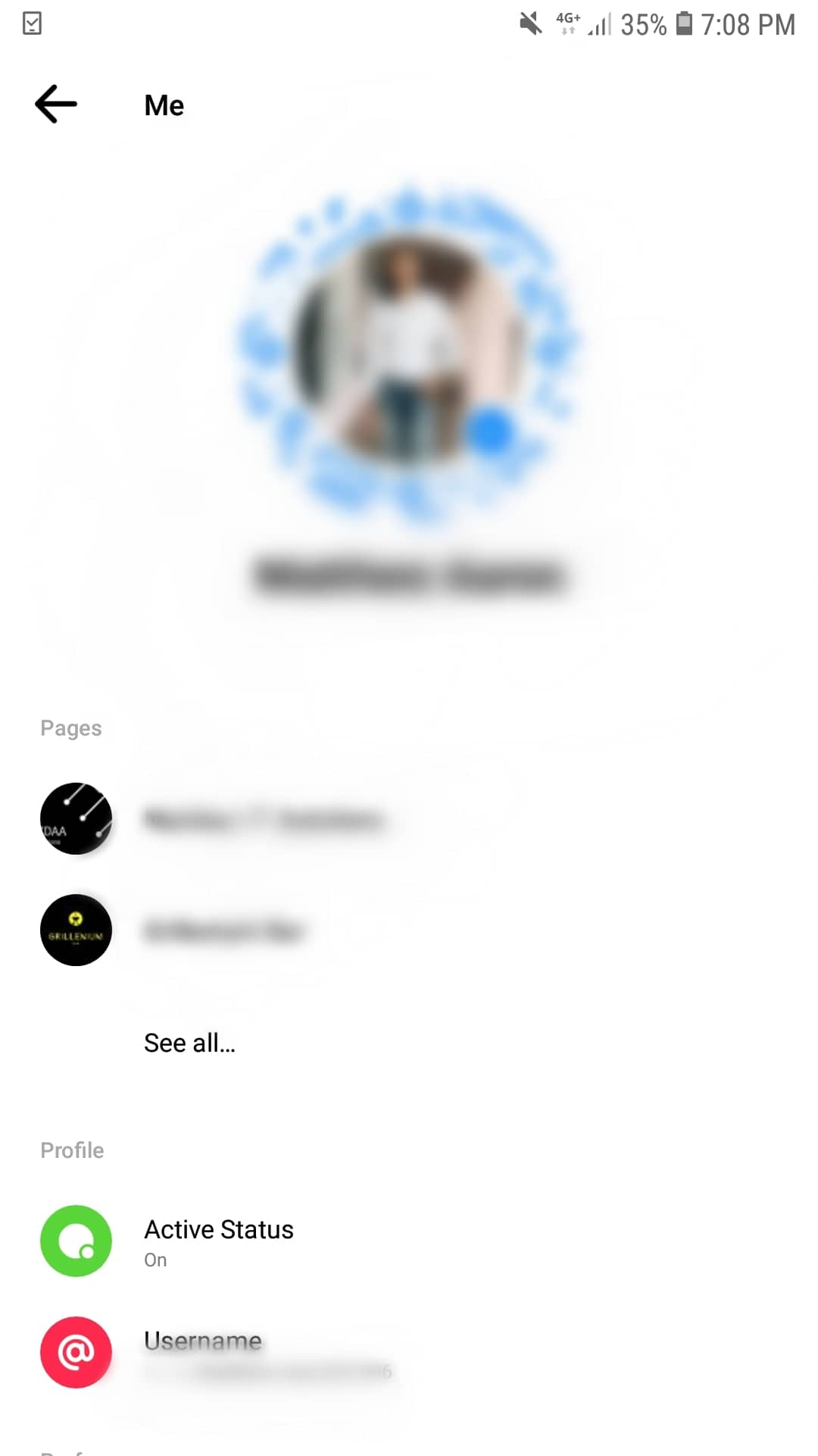
If you have a look at the top left part of the Messenger app, you will see your profile. In the new redesign, clicking on the profile immediately allows you to see the pages you have. In the previous design, it does not allow you to see it immediately.
In addition to that, you can also change your username in the profile section now! After the part where you see the different pages you are in or have, you can see there that you have the option to change your username.
Overall the new update is good. Messenger this time around, focused on making the app simpler to use and is better oriented and focused on what someone actually uses the app for.
Have you seen the Messenger’s new redesign? Have you updated yours yet? What are you waiting for? Join the hype now and enjoy Messenger’s new colors, functions, and features.

